This is the old blog from Peony and Parakeet.
Welcome to follow the new blog at www.peonyandparakeet.com/blog
This post is also found in the new blog, go to:
http://www.peonyandparakeet.com/5-tips-to-choosing-colors/

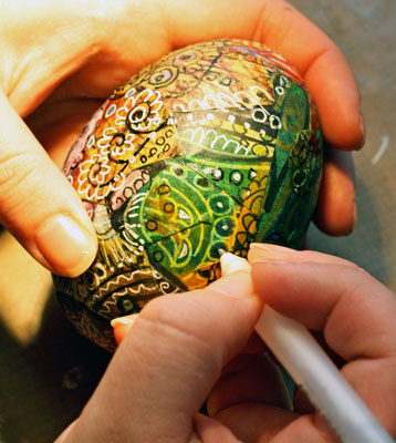
People often comment the colors on my work. No wonder as my design process is very color driven! Here are some guidelines that I have developed for choosing colors.
1) Start with the color
Whether I am about to dye, paint, knit or make a new design, I often start with the feeling that I want to express. I see the feeling in color, there's often the exact hue that comes to my mind. Sometimes it's a combination of two or three colors.
I have learned to interpret abstract things to colors by observing color in everything I see. Try to omit the functions, shapes and patterns of the objects and concentrate on colors. Do not worry about what you are going to make, choose the materials by their hue and start creating!
My paper designs often start with the idea of color. This lime yellow represents the warmth of summer for me!
2) Mix the colors you hate with the colors you love
The one mistake you can make is that you only give attention to the colors that cause positive reactions. I often go deep into hues that I absolutely hate. I have noticed that by combining them with the colors I love create great impressions that are more real than if I use only my positive colors. And within the time I learn to see the beauty in every color.
Like I used to hate pink. Nowadays one of my favorite color combinations are muted orange red and pink. I get really emotional when I see them together. They represent something about my childhood that I cannot put in words.
Alku yarn in Eleanor colorway, the hated pink and the loved orange red!
3) Control the quantity of each color
I like to control the quantity of each color. I often have a few colors that cover the most of the surface and some that I use in small amounts. When making the color palette for your design, keep in mind that you do not need large quantities of the color you want to get attention to. Small colored areas that locate in the main focal points can create great impact. The colors interact with the composition of your work.
You can practice this by taking photos and analyzing them. Analyze why the certain colors in a photo draw your attention.
 A photo that is black and white for me. The focal point is the place where the light hits the road. It emphasizes the darkness of the shadow.
4) Make your own colors
I try to avoid colors that come straight from the jar. Even if they seem beautiful. In the end they usually look artificial. Probably because it's so easy to use them in too large quantities!
If you mix your own colors you get exciting variations of the same color which makes your work look more natural. You can also use the same components in many different colors which makes them go better together. When you start with the blues, yellows and reds, you can create huge amount of colors and hues with less cost and with better controllability. And if you end up creating ugly colors, see step two!
I often add a hint of black to create a muted tone but you might prefer pastels and use white instead.
Mixing the black to the yellow to achieve the right hue for the hall (the result is shown in the first photo of this post). / Using white to create soft pastels in knitted fabric.
5) Put the color theory into practice
With this blog post I do not want to underestimate the value of color theory. I have learned Josef Albers color theory during the designer studies. For Josef Albers the color was everything,
see this inspiring video of him and his works! Whether you learn the basic color theory or dwell deeper into Josef Albers experiments, it's always good to experiment too. Get your safe color combos and then move to the more dangerous ones! You can never know too much about colors!
Here's a snapshot of the library room where I like to create most of the color combinations. I am surrounded here by colors, textures and patterns and I find it so inspiring! One of my newest fabrics is on the chair and I think it's suits the room perfectly!


